
Data Visualization
Simple Ways to Improve Your Matplotlib
Matplotlib is typically the first data visualization package that Python programmers learn. While its users can create basic figures with just a few lines of code, these resulting default plots often prove insufficient in both design aesthetics and communicative power. Simple adjustments can lead to dramatic improvements, however, and in this post, I will share several tips on how to upgrade your Matplotlib figures.
In the examples that follow, I will be using information found in this Kaggle dataset about cereals. I have normalized three features (calories, fat, and sugar) by serving size to better compare cereal nutrition and ratings. Details about these data transformations and the code used to generate each example figure can be found on GitHub.
Remove Spines
The first Matplotlib default to update is that black box surrounding each plot, comprised of four so-called “spines.” To adjust them we first get our figure’s axes via pyplot and then change the visibility of each individual spine as desired.
Let’s say, for example, we want to remove the top and right spines. If we have imported Matplotlib’s pyplot submodule with:
from matplotlib import pyplot as plt
we just need to add the following to our code:
plt.gca().spines['top'].set_visible(False)
plt.gca().spines['right'].set_visible(False)
and the top and right spines will no longer appear. Removing these distracting lines allows more focus to be directed toward your data.
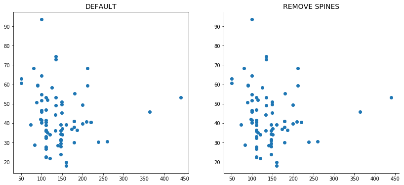
Removing distracting spines can help people focus on your data.
Explore Color Options
Matplotlib’s default colors just got an upgrade but you can still easily change them to make your plots more attractive or even to reflect your company’s brand colors.
Hex Codes
One of my favorite methods for updating Matplotlib’s colors is directly passing hex codes into the color argument because it allows me to be extremely specific about my color choices.
plt.scatter(..., color='#0000CC')
This handy tool can help you select an appropriate hex color by testing it against white and black text as well as comparing several lighter and darker shades. Alternatively, you can take a more scientific approach when choosing your palette by checking out Colorgorical by Connor Gramazio from the Brown Visualization Research Lab. The Colorgorical tool allows you to build a color palette by balancing various preferences like human perceptual difference and aesthetic pleasure.
xkcd Colors
The xkcd color library provides another great way to update Matplotlib’s default colors. These 954 colors were specifically curated and named by several hundred thousand participants of the xkcd color name survey. You can use them in Matplotlib by prefixing their names with “xkcd:”.
plt.scatter(..., color='xkcd:lightish blue')
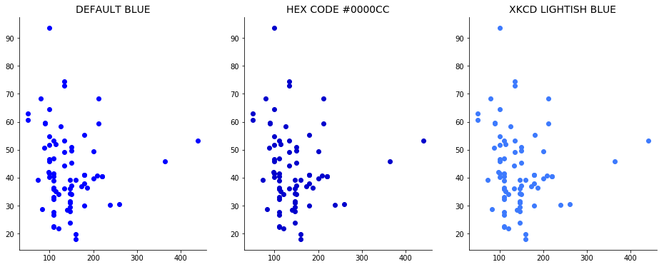
Matplotlib's default colors can easily be updated by passing hex codes or referencing the xkcd library.
Layer Graph Objects
Matplotlib allows users to layer multiple graphics on top of each other, which proves convenient when comparing results or setting baselines. Two useful properties should be utilized while layering: 1) alpha for controlling each component’s opacity and 2) zorder for moving objects to the foreground or background.
Opacity
The alpha property in Matplotlib adjusts an object’s opacity. This value ranges from zero to one with zero being fully transparent (invisible 👀) and one being entirely opaque. Reducing alpha will make your plot objects see-through, allowing multiple layers to be seen at once as well as allowing overlapping points to be distinguished, say, in a scatter plot.
plt.scatter(..., alpha=0.5)
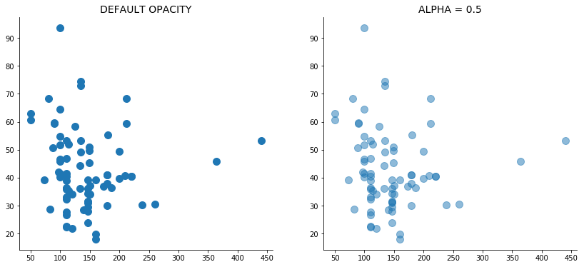
Decreasing alpha reduces opacity and can help you visualize overlapping points.
Order
Matplotlib’s zorder property determines how close objects are to the foreground. Objects with smaller zorder values appear closer to the background, while those with larger values present closer to the front. If I’m making a scatter plot with an accompanying line plot, for example, I can bring the line forward by increasing its zorder.
plt.scatter(..., zorder=1)  #background
plt.plot(..., zorder=2)     #foreground
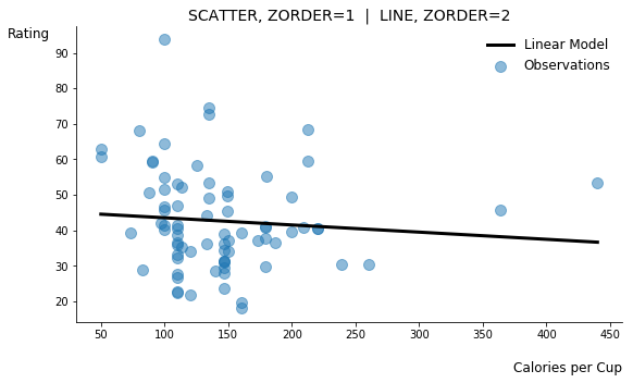
Plot objects can be brought to the foreground or pushed to the background by adjusting zorder.
Annotate Main Points or Examples
Many visuals can benefit from the annotation of main points or specific, illustrative examples because these directly convey ideas and boost the validity of results. To add text to a Matplotlib figure, just include annotation code specifying the desired text and its location.
plt.annotate(TEXT, (X_POSITION, Y_POSITION), ...)
The cereal dataset used to produced this blog’s visuals contains nutritional information about several brand name cereals along with a feature labeled as “rating.” One might firstly assume that “rating” is a score indicating cereals that consumers prefer. In the zorder figure above, however, I built a quick linear regression model showing that the correlation between calories per cup and rating is practically non-existent. It seems unlikely that calories would not factor into consumer preference, so we may already be skeptical about our initial assumption about “rating.”
This misconception becomes even more obvious when examining the extremes: Cap’n Crunch is the lowest rated cereal while All-Bran with Extra Fiber rates the highest. Annotating the figure with these representative examples immediately dispels false assumptions about “rating.” This rating information more likely indicates a cereal’s nutritional value. (I have also annotated the cereal with the most calories per cup; Grape Nuts is likely not meant to be consumed in such large quantities! 😆)
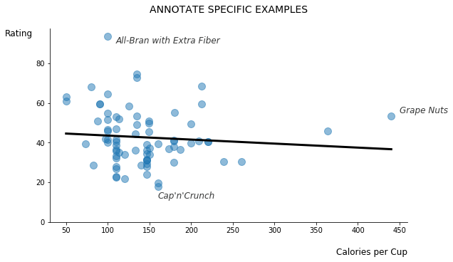
Annotating your visuals with a few examples can improve communication and add legitimacy.
Baseline and Highlight
Adding a baseline to your visuals helps set expectations. A simple horizontal or vertical line provides others with appropriate context and often speeds along their understanding of your results. Highlighting a specific region of interest, meanwhile, can further emphasize your conclusions and also facilitates communication with your audience. Matplotlib offers several options for baselining and highlighting, including horizontal and vertical lines, shapes such as rectangles, horizontal and vertical span shading, and filling between two lines.
Horizontal and Vertical Lines
Let’s now consider the interplay between fat and sugar in our cereal dataset. A basic scatter plot of this relationship doesn’t appear interesting at first, but after exploring further, we find the median fat per cup of cereal is just one gram because so many cereals contain no fat at all. Adding this baseline helps people arrive at this finding much more quickly.
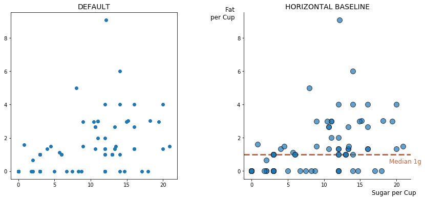
A horizontal or vertical baseline can help set the stage for your data.
In other cases you may want to completely remove the default x- and y-axes that Matplotlib provides and create your own axes based on some data aggregate. This process requires three key steps: 1) remove all default spines, 2) remove tick marks, and 3) add new axes as horizontal and vertical lines.
#1. Remove spines
for spine in plt.gca().spines.values():
    spine.set_visible(False)

#2. Remove ticks
plt.xticks([])
plt.yticks([])

#3. Add horizontal and vertical lines
plt.axhline(Y_POSITION, ...)  #horizontal line
plt.axvline(X_POSITION, ...)  #vertical line
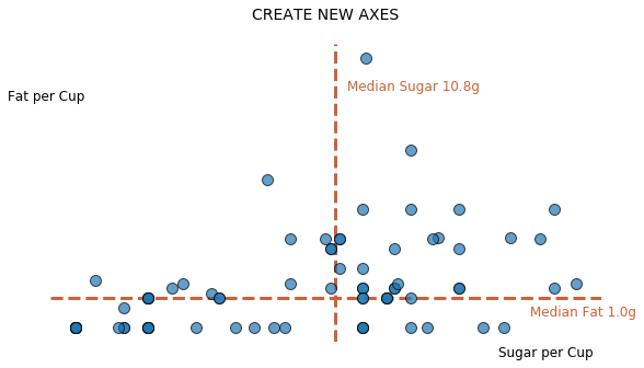
You can also create new axes for your data by removing spines and ticks and adding custom lines.
Rectangle
Now that we have plotted the cereals’ fat and sugar contents on new axes, it appears that very few cereals are low in sugar but high in fat. That is, the upper-left quadrant is nearly empty. This seems reasonable because cereals typically are not savory. To make this point abundantly clear, we could direct attention to this low-sugar, high-fat area by drawing a rectangle around it and annotating. Matplotlib provides access to several shapes through its patches module, including a rectangle or even a dolphin. Begin by importing code for the rectangle:
from matplotlib.patches import Rectangle
Then to create a rectangle on the figure, grab the current axes and add a rectangular patch with its location, width, and height:
plt.gca().add_patch(Rectangle((X_POSITION, Y_POSITION), WIDTH, HEIGHT, ...)
Here, the x- and y-positions refer to the placement of the lower-left corner of the rectangle.
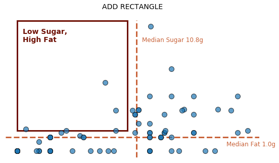
To direct people toward a particular part of your visual, consider adding a rectangle.
Shading
Shading provides an alternative option for drawing attention to a particular region of your figure, and there are a few ways to add shading with Matplotlib.
If you intend to highlight an entire horizontal or vertical area, just layer a span into your visual:
plt.axhspan(Y_START, Y_END, ...)  #horizontal shading
plt.axvspan(X_START, X_END, ...)  #vertical shading
Previously discussed properties like alpha and zorder are critical here because you will likely want to make your shading transparent and/or move it to the background.
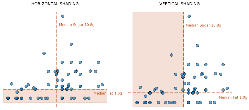
Shading also provides an effective way to highlight a particular region of your plot.
If the area you would like to shade follows more complicated logic, however, you may instead shade between two user-defined lines. This approach takes a set of x-values, two sets of y-values for the first and second lines, and an optional where argument that allows you to use logic to filter down to your region of interest.
plt.gca().fill_between(X_VALUES, Y_LINE1, Y_LINE2, WHERE=FILTER LOGIC, ...)
To shade the same area that was previously highlighted with a rectangle, simply define an array of equally spaced sugar values for the x-axis, fill between the median and max fat values on the y-axis (high fat), and filter down to sugar values less than the median (low sugar).
sugars = np.linspace(df.sugars_per_cup.min(), df.sugars_per_cup.max(), 1000)

plt.gca().fill_between(sugars, df.fat_per_cup.median(), df.fat_per_cup.max(),
                       WHERE=sugars < df.sugars_per_cup.median(), ...)
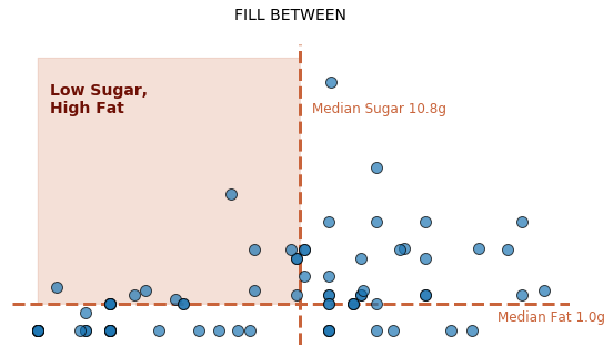
More complex shading logic is accomplished by filling between two lines and applying a filter.
Conclusion
Matplotlib often gets a bad reputation due to its poor defaults and the shear amount of code needed to produce decent looking visuals. Hopefully, the tips provided in this blog will help you address the first issue, though I’ll admit that the final few example figures required many updates and subsequently a sizable amount of code. If the required bulk of code bothers you, the Seaborn visualization library is an excellent alternative to Matplotlib. It comes with better defaults overall, demands fewer lines of code, and supports customization via traditional Matplotlib syntax if needed.
The main thing to keep in mind when you visualize data–no matter which package you choose–is your audience. The suggestions I’ve offered here aim to smooth out the data communication process by 1) removing extraneous bits like unnecessary spines or tick marks, 2) telling the data story quicker by setting expectations with layering and baselines, and 3) highlighting main conclusions with shading and annotations. The resulting aesthetics also improve, but the primary goal is stronger and more seamless data communication.
I recently shared content similar to this in a data visualization talk at ODSC NYC. You can access my original conference materials as well as the code that powers each example figure in the links below.
| Check out this code on GitHub! | Check out my ODSC conference materials with Google Colab! |
VISUALIZATIONS