Math Applications
Measuring Statistical Dispersion with the Gini Coefficient
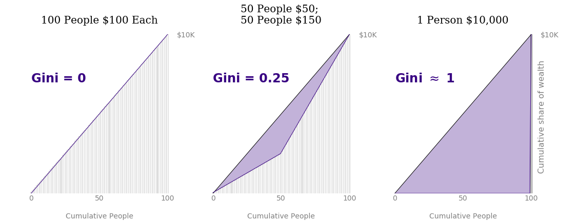
If you work with data long enough, you are bound to discover that a dataset’s mean rarely–if ever–tells you the full data story. As a simple example, each of the following groups of people have the same average pay of $100:
- 100 people who make $100 each
- 50 people who make $150 each and 50 people who make $50
- 1 person who makes $10,000 and 99 people who make nothing
The primary difference, of course, is the way that money is distributed among the people, also known as the statistical dispersion. Perhaps the most popular measurement of statistical dispersion is standard deviation or variance; however, you can leverage other metrics, such as the Gini coefficient, to obtain a new perspective.
The Gini coefficient, also known as the Gini index or the Gini ratio, was introduced in 1912 by Italian statistician and sociologist Corrado Gini. Analysts have historically used this value to study income or wealth distributions; in fact, despite being developed over 100 years ago, the United Nations still uses the Gini coefficient to understand monetary inequities in their annual ranking of nations. But the Gini coefficient may be utilized much more broadly! After a more thorough mathematical explanation, let’s apply the Gini coefficient to a few non-standard use cases that do not involve international economies: baby names and healthcare pricing.
Defining Gini
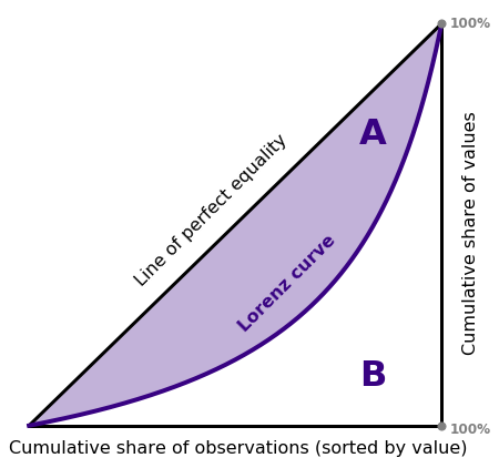
The first step in understanding the Gini coefficient requires a discussion about the Lorenz curve, a graph developed by Max Lorenz for visualizing income or wealth distribution. To trace out the Lorenz curve, begin by taking the incomes of a population and sorting them from smallest to largest. Then build a line plot where the \(x\)-values represent the percentage of people seen thus far and the \(y\)-values represent the cumulative proportion of wealth attributed to this percentage of people. For example, if the poorest 30% of the population holds 10% of a population’s wealth, the curve should pass through the scaled \(x,y\) coordinates (0.3, 0.1). Note also that if wealth is distributed evenly among all members of a population, the Lorenz curve follows a straight line, \(x=y\). See the figure below for an illustration of a hypothetical Lorenz curve along with the line of equality.
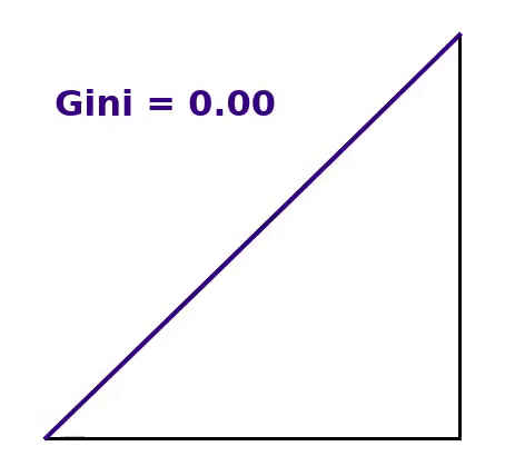
The Gini coefficient measures how much a population’s Lorenz curve deviates from perfect equality or how much a set of data diverges from equal values. The Gini coefficient typically ranges from zero to one1, where
- zero represents perfect equality (e.g. everyone has an equal amount) and
- one represents near perfect inequality (e.g. one person has all the money).
For all situations in between, the Gini coefficient \(G\) is defined as \[G = \frac{A}{A + B}\] where \(A\) signifies the region enclosed between the line of perfect equality and the Lorenz curve, as indicated in the figure above, while \(A + B\) represents the total triangular area.
Each of the three situations discussed in the introduction produce an average of $100 per person. The Gini coefficient, however, varies greatly for each scenario as seen in the figure below.
Gini in Python
To calculate a dataset’s Gini coefficient with Python, you have the option of computing the shaded area \(A\) with something like scipy’s quadrature routine. If this style of numerical integration proves slow or too complicated for applications at scale, you can utilize an alternative, equivalent definition of the Gini coefficient.
The Gini coefficient may also be expressed as half of the data’s relative mean absolute difference, a normalized form of the average absolute difference among all pairs of observations in the dataset. \[ G = \frac{\sum\limits_i \sum\limits_j |x_i - x_j|}{2\sum\limits_i\sum\limits_j x_j}\]
The calculation simplifies further if the data consist of only positive values as it becomes unnecessary to evaluate all possible pairs. Sorting the datapoints in ascending order and assigning a positional index \(i\) yields \[G = \frac{\sum\limits_i (2i - n - 1)x_i}{n\sum\limits_i x_i}, \] which is even speedier to compute.
The best Python implementation of the Gini coefficient that I’ve found comes from Olivia Guest. I will subsequently leverage her vectorized numpy routine to calculate Gini in the case studies that follow.
Case #1: Baby Names
So far we have mostly addressed the Gini coefficient in the context of its original field of economics. This metric generalizes, however, to provide insight whenever statistical dispersion plays a critical role. I will now illustrate two atypical applications to demonstrate how using the Gini coefficient augments the workflow of exploratory data analysis.
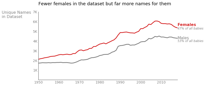
The Social Security Administration of the United States (SSA) hosts public records on the names given to US babies for research purposes. Aggregating these data for children born since 1950, I discovered that 18 out of the top 20 most popular names more commonly associate with male children. So where are the females?

Slightly more male babies are actually born each year, and certainly more male babies have been registered with the SSA (53% male vs 47% female); nonetheless, I was still surprised to see such a large proportion of male names in my quick popularity chart. Digging into the data further, I found that even though fewer females appear in the data, there have been consistently more unique female names each year.
Statistical dispersion appears to play a significant role. To put it back in financial terms, some male names like the ones on my top 20 list are just extremely “wealthy.” (The most popular name, “Michael,” accounts for over 3% of all male children born since 1950.) These ultra-popular masculine names likely pass down from generation to generation. Females babies, on the other hand, are distributed more widely across a variety of names, so extra names share in the “wealth” of female children. We can verify this theory by returning to the Gini coefficient.
Consider how female children disperse across each name. Some names in the dataset account for only 5 babies2 since 1950, while “Jennifer” represents nearly 1.5 million individuals. Tallying up all females born with each name since 1950 and sorting the names from least to most popular, we find the Gini coefficient to be 0.96, implying a huge disparity in the most popular versus the most unique names.
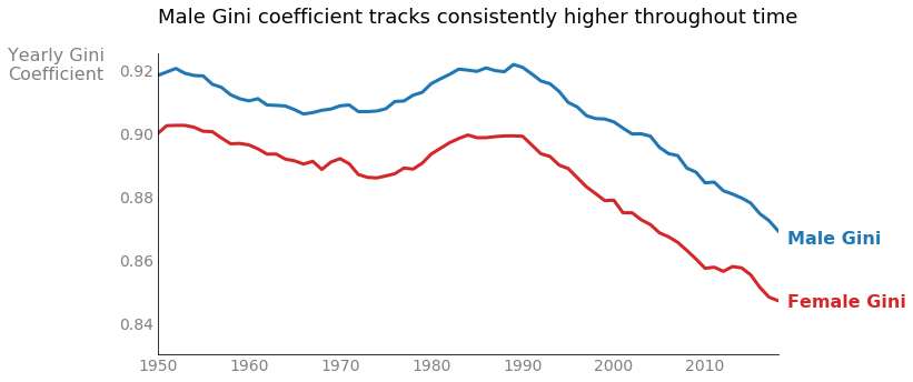
Male names exhibit a very similar Lorenz curve but with a little more skew, registering a Gini coefficient of 0.97. The difference between male and female coefficients appears insignificant, but consider an alternative viewpoint. Instead of aggregating across time, calculate a yearly Gini coefficient for each gender. Plotting both the female and male Gini coefficients for each year since 1950 demonstrates a clear and persistent pattern where the male coefficient presents consistently higher.3 Thus male names experience more statistical dispersion than female monikers. Also of note, the Gini values for both genders have ticked downward since the 1990s, indicating a trending preference toward more diverse naming conventions.
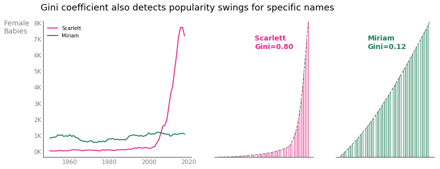
In a final look at this dataset, let’s examine popularity trends for individual names over time. Now utilize Gini by grouping the female data by name and calculating the Gini coefficient as it pertains to yearly frequencies; that is, for any given name, sort each year of the dataset by that name’s least to most popular year in order to compute Gini. Names with lower Gini coefficients demonstrate similar levels of popularity throughout the entire time span, while higher coefficients imply uneven popularity levels. The figure below compares popularity trends for the names “Scarlett” and “Miriam.” Both names represent about 60,000 female babies in the dataset; however, the sharp increase in babies named “Scarlett” generates a large Gini coefficient while “Miriam” sees a low Gini value since the name has consistently been given to roughly 1,000 babies every year since 1950.
Case #2: Healthcare Prices
Now shift to this 2017 healthcare pricing dataset hosted by the Centers for Medicare and Medicaid Services, a federal agency of the United States. These data, aggregated as procedural averages for individual hospitals, include the charges and eventual payments for over 500 separate inpatient procedures for Medicare patients. I applied Gini coefficient calculations to determine which, if any, procedures require better billing standardization. The underlying basis for my analysis boils down to this: the higher the Gini coefficient, the greater the disparity in what different hospitals charge for a given procedure. Procedures with large Gini values could then necessitate regulation or more transparent cost details.
The procedure, or diagnosis related group (DRG), with the highest Gini coefficient in this dataset4 is labeled as, “Alcohol/Drug Abuse or Dependency w Rehabilitation Therapy.” This perhaps elicits little surprise given that rehabilitation therapies vary widely both in terms of treatment length and illness severity; we probably expect a wide range in what assorted hospitals charge. In fact, all diagnoses with the largest Gini coefficients, such as coagulation disorders and psychoses, can vary in severity. Procedural charges that show the most uniformity among the hospitals, on the other hand, mostly describe one-time cardiac events such as value replacement, percutaneous surgeries, or observation for chest pain.
| Alcohol/Drug Abuse or Dependence w Rehabilitation Therapy | Aortic and Heart Assist Procedures except Pulsation Balloon w MCC |
| Coagulation Disorders | Angina Pectoris |
| Alcohol/Drug Abuse or Dependence, Left AMA | Cardiac Valve & Oth Maj Cardiothoracic Proc w/o Card Cath w/o CC/MCC |
| Psychoses | Heart Transplant or Implant of Heart Assist System w MCC |
| Other Respiratory System Diagnoses w MCC | Perc Cardiovasc Proc w/o Coronary Artery Stent w/o MCC |
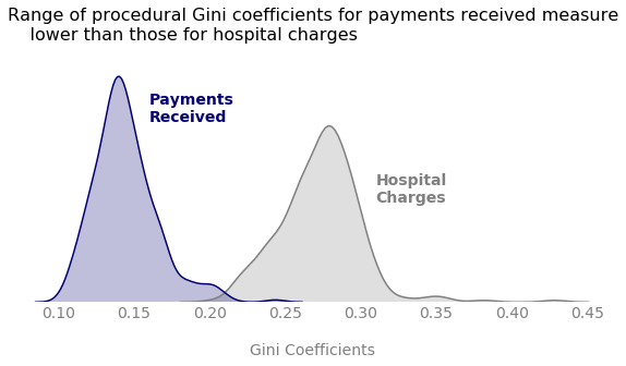
So what about billing regulation? Do we need more safeguards in place to be sure hospitals are charging similar amounts for similar procedures? Well, more cost transparency certainly doesn’t hurt, especially for treatments that range in duration or intensity, but let’s go back to the dataset. In addition to the information about the amounts hospitals charge, the data also contain the total payments that the hospitals actually received. Applying the same type of analysis to the payments received yields much lower Gini values. In fact, the Gini coefficient is lower for the average payments received than the hospital charges, for every single procedure. This curious insight signals that the contracts in place for Medicare payments already do quite a lot to moderate and regularize procedural costs.5
Conclusion
The Gini coefficient continues to provide insight over 100 years after its inception. As a good general-purpose measure of statistical dispersion, Gini can be used broadly to explore and understand data from nearly any discipline. Currently, the most popular metric for understanding data spread is likely standard deviation; however, there are several key differences between standard deviation and the Gini coefficient. Firstly, standard deviation retains the scale of your data. You report the standard deviation of US incomes in dollars, while you might give the standard deviation of temperatures in degrees Celsius. The Gini coefficient, however, has no measurement unit, also called scale invariance. Secondly, standard deviation is unbounded in that it can be any non-negative value, but Gini typically ranges between zero and one. Gini’s scale invariance and strict bounds make comparing statistical dispersion between two dissimilar data sources much easier. Lastly, standard deviation and the Gini coefficient judge statistical dispersion through different lenses. Gini reaches its maximum value for a non-negative dataset if it contains one positive and the rest zeros. Standard deviation reaches its maximum if half the data live at the extreme maximum and the other half register at the extreme minimum.
Certain limitations apply to the Gini coefficient despite its many benefits. Like other summary statistics, Gini condenses information thereby losing the granularity of the original dataset. Gini is also many-to-one, which means various different distributions map to the same coefficient. The Gini coefficient proves to be quite sensitive to outliers such that a singular extreme datapoint (large or small) can increase Gini dramatically. Yet, economists have also criticized the Gini coefficient for being undersensitive to wealth changes in upper and lower echelons. Researchers have go on to introduce several alternative metrics to study different aspects of income inequality, such as the Palma ratio, which explicitly captures financial fluctuations for the richest 10% and the poorest 40% of a population.
No matter which metric you choose to understand statistical dispersion, building data intuition certainly goes beyond simple estimates of the mean or median. The Gini coefficient, long since popular in the field of economics, provides excellent insight about the spread of data regardless of your chosen subject area. As demonstrated in this post, Gini could be tracked over time, calculated for specific segments of your data, or used to detect processes requiring better price standardization. Its applications are limitless, and it might just be the missing component of your EDA toolkit.
Check out this code on GitHub!
The Gini coefficient is strictly non-negative, \(G \geq 0\), as long as the mean of the data is assumed positive. Gini can theoretically be greater than one if some data values are negative, which occurs in the context of wealth if some people contribute negatively in the form of debts owed. ↩
The Social Security Administration does not include names that are given to fewer than 5 babies per gender per state due to privacy reasons; therefore, five children for one given female name since 1950 signifies the absolute minimum allowed. ↩
The Gini values displayed in the yearly figure are less than the aggregate because popular names tend to stay popular year after year thus bolstering naming inequality and increasing the Gini coefficient. ↩
Some diagnosis related groups (DRGs) occur at as few as one hospital for the entire year. I have filtered the dataset down to procedures that are documented by at least 50 hospitals to avoid high variance issues. ↩
The payments hospitals receive are strictly less than the amounts they charge. Decreasing a dataset’s mean while holding its standard deviation fixed actually increases the Gini coefficient. Here we observe just the opposite effect so statistical dispersion must be lessened in the payments received. ↩
MATHEMATICS · APPLICATIONS